interior design

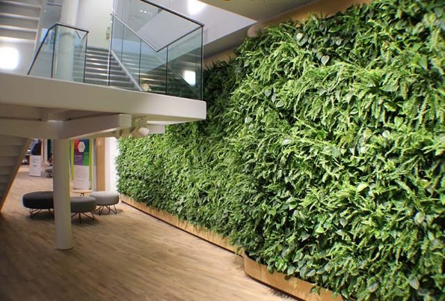
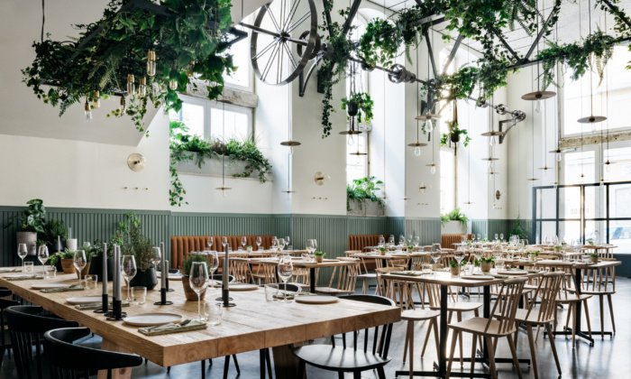
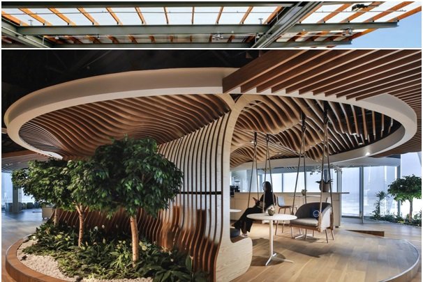
An Introduction to Biophilic Design

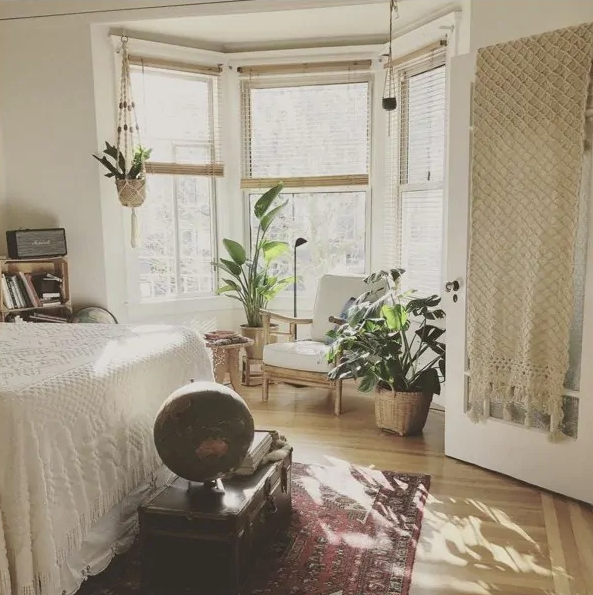
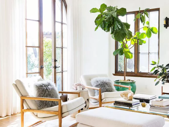
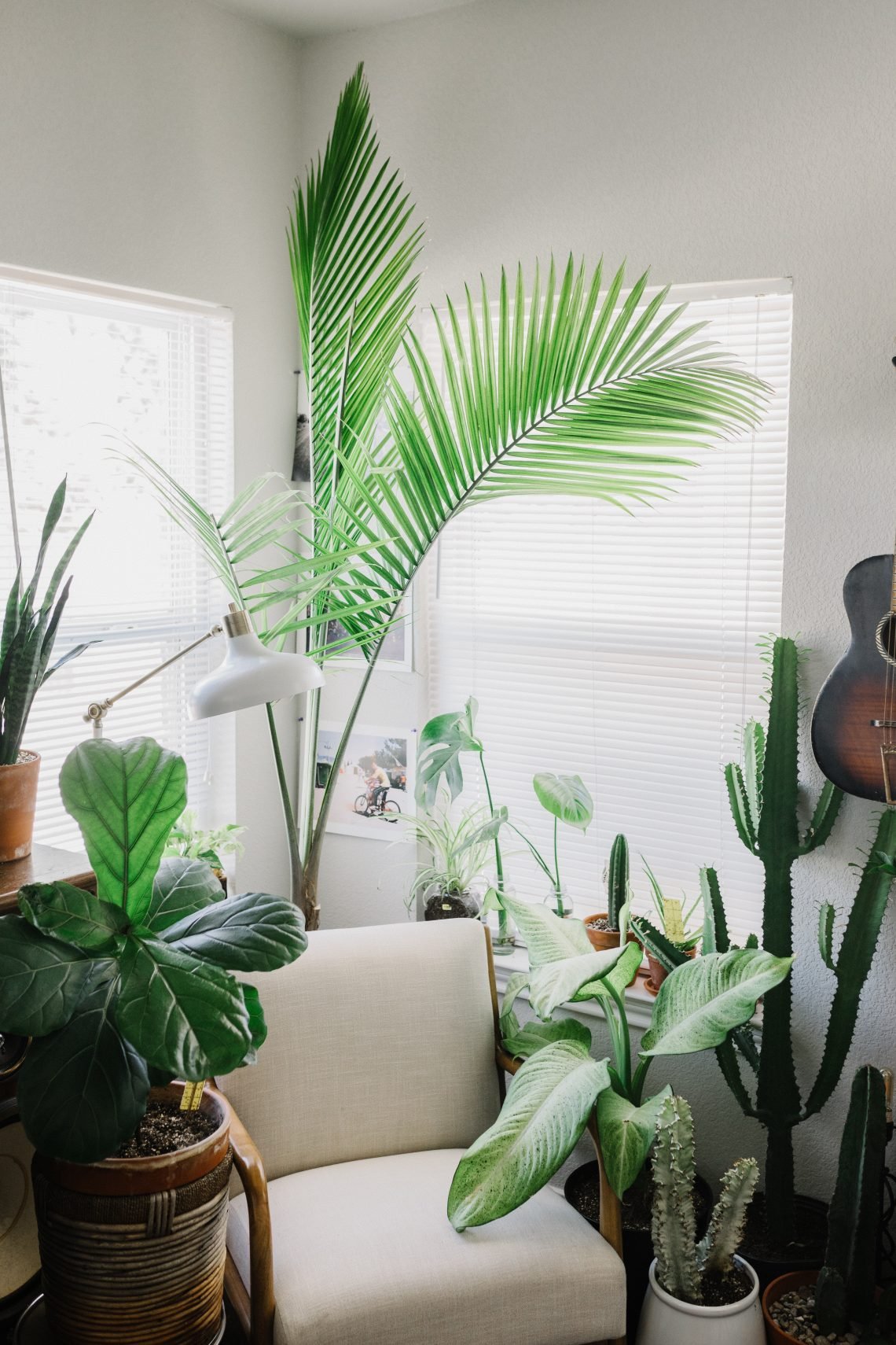
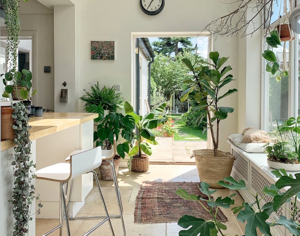
Biophilic Design, what is it? According to pebblemag.com, “biophilic design is the practice of creating a closer connection to nature through the ways buildings and landscapes are created and built”. Derived from the term “biophilia” meaning “a love of nature”, this design principle is more than a trend.

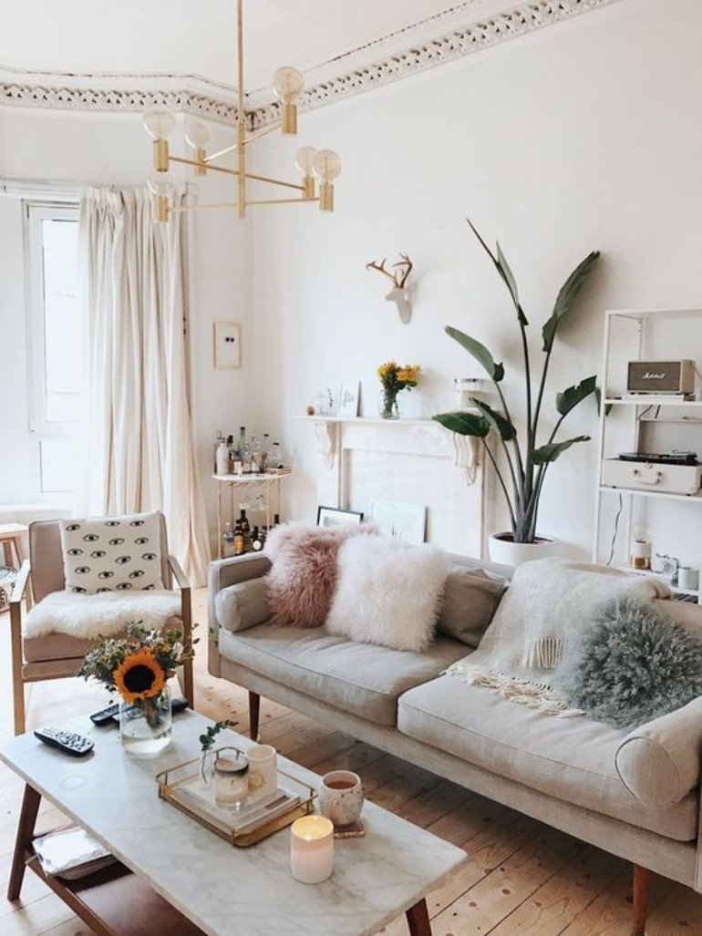
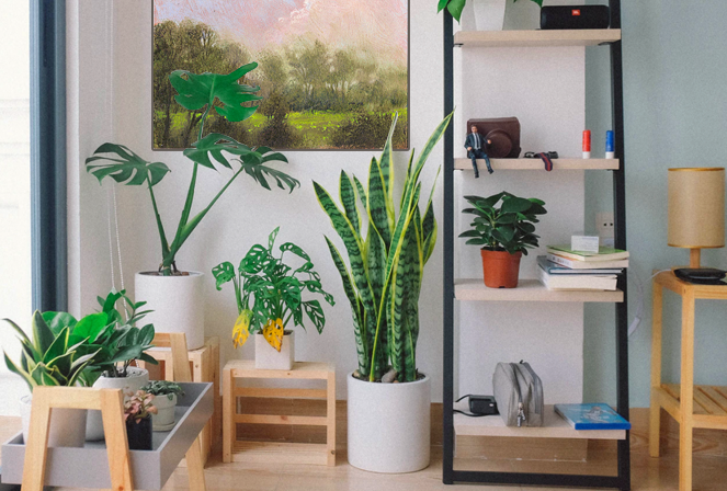
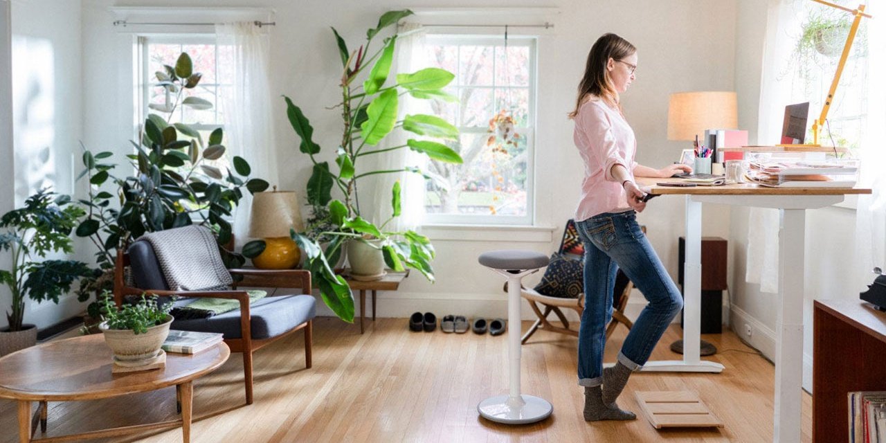
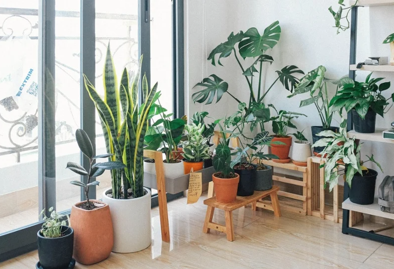
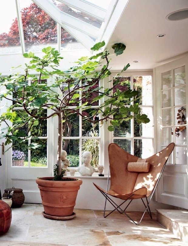
The connection to nature through design can be achieved in many ways. Houseplants seem to be the first thing most people think of, but the design encompasses so much more than just indoor plants. 


This isn’t necessarily a bad thing though, a single, green plant can completely transform a room!

Image Credit: Katherine Carter

Note: If you have curious paws in your household, it is a good idea to do research on the best plants to bring home. Many common houseplants are actually pretty toxic to dogs and cats! The ASPCA has a complete list of toxic and non-toxic plants for animals.

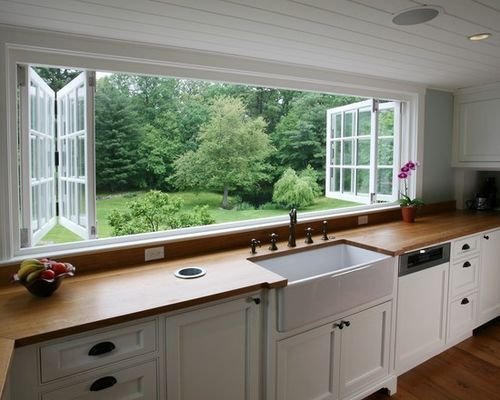
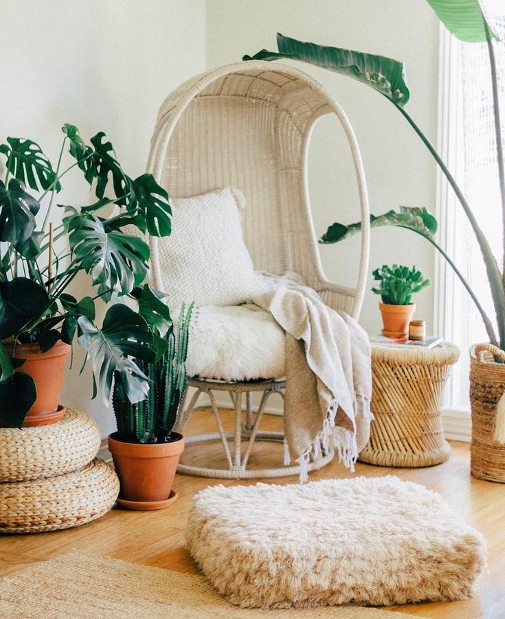
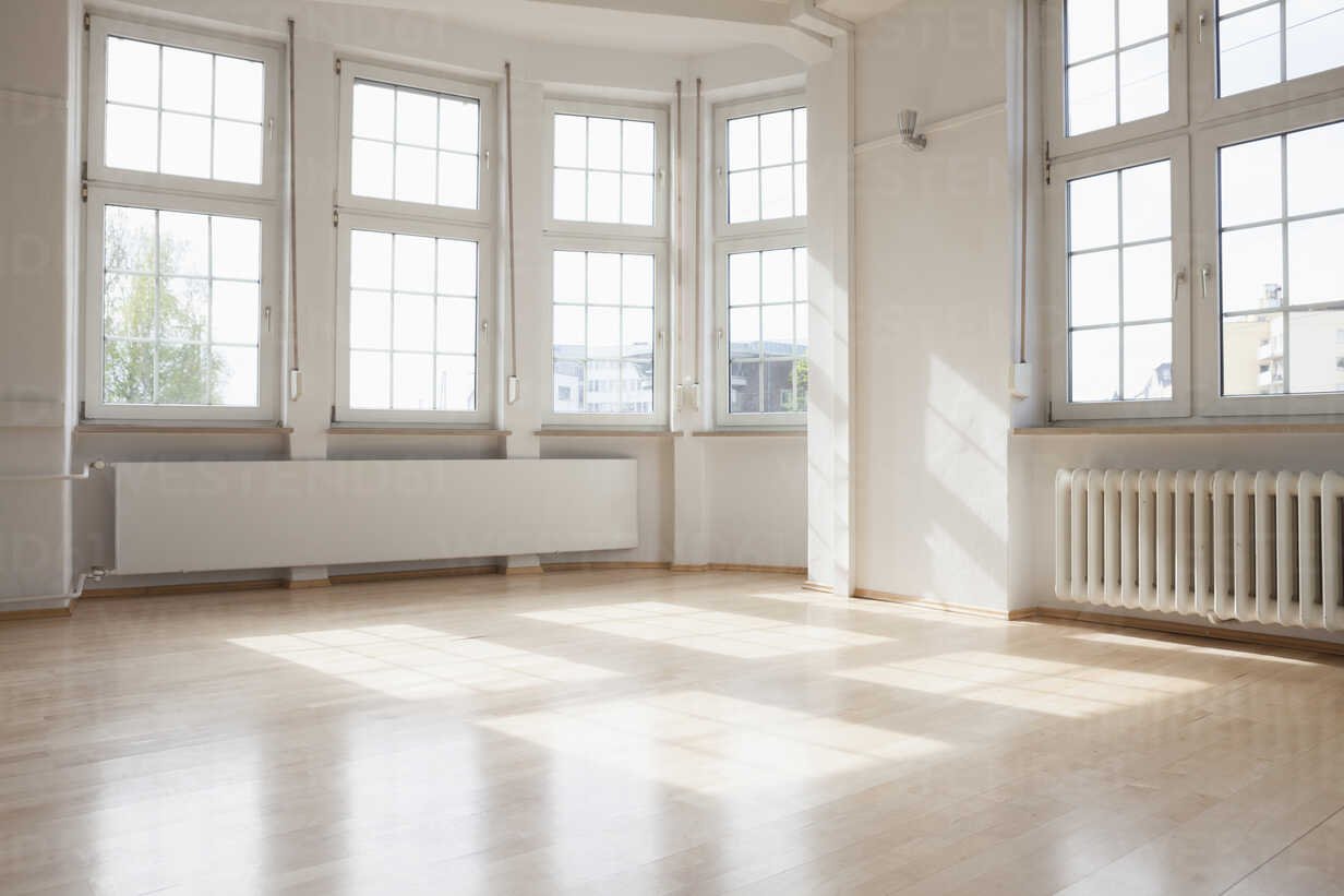
Biophilic design can include natural lighting and fresh air, neutral colors, water features, organic materials (sustainable wood, cork, bamboo, stone, rattan, etc.), and carefully selected decor choices that take our minds back to their most innate and primitive frame of reference: nature. 
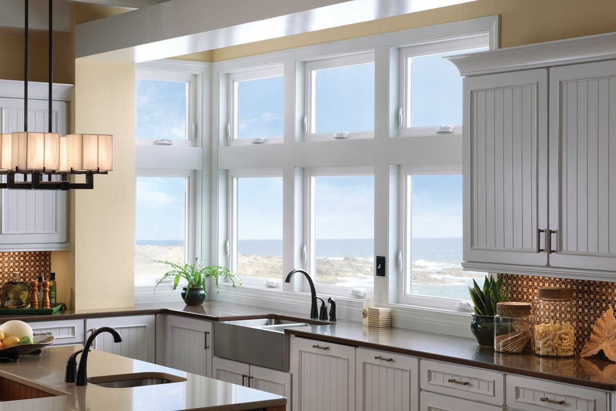
There are numerous benefits to biophilic design, including improved air quality, better moods, reduced stress levels, increased focus and engagement, higher productivity, and an overall improved sense of wellbeing. 

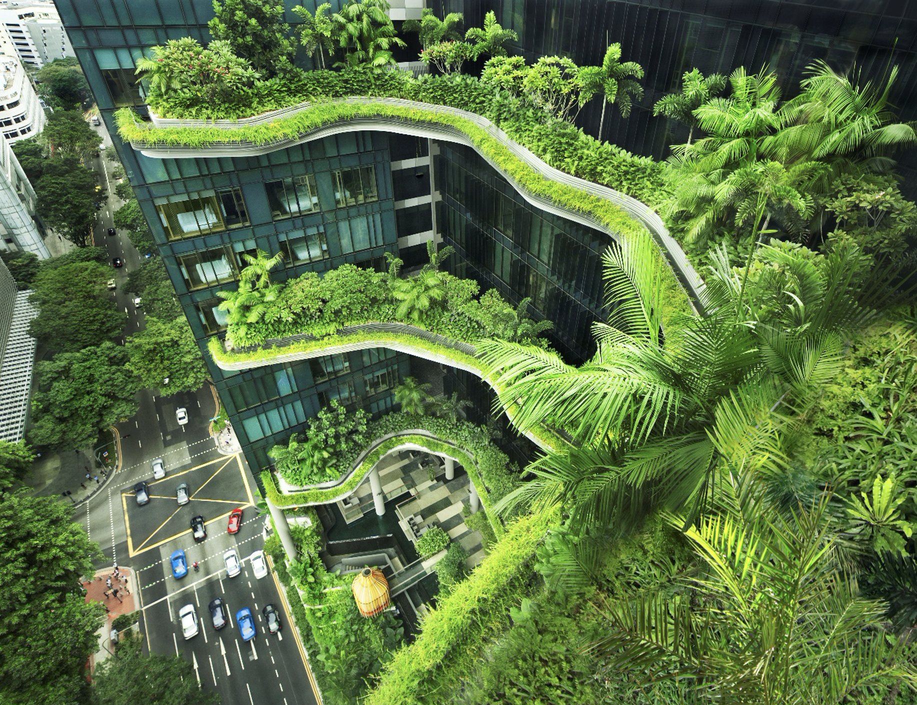
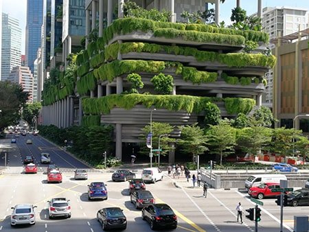
Implementing biophilic design is easy, as it is a relatively neutral style that can be mixed with other interior design styles. It can be as simple as taking a few minutes to open the blinds each day, adding an indoor plant to to your office desk, and choosing sustainably sourced natural materials when looking for new furniture. With so many benefits, we will likely see more offices, schools, public areas, homes, and even cities create a closer connection to nature in the next few years.

According to the Global Wellness Summit, biophilia is not a passing trend, but rather the long-term future of architecture and design.

What do you think of this design style? Would you implement it in your home? How do you feel about seeing it in hotels, offices, and schools?

Renter-Friendly Design Tips

With the percentage of Americans choosing to own their homes are steadily declining for multiple reasons, there are more renters than any time since 1965. A skyrocketing housing market, greater student loan debt, upfront affordability, and the maintenance costs are all reasons contributing to the increase in households that are choosing to rent. 

There were 44.1 million households renting in 2021, many without a way to purchase a home in the current market. Therefore, making the most of a rental space is crucial. Unfortunately, the majority of landlords have limits to what improvements a renter can make during their lease. To make matters worse, rent is increasing all over the United States. It is even more important to transform your plain rental apartment or house into a place you love to be, if you are spending more money than ever to be there. 

In this article, we will discuss renter-friendly ways you can improve your space to make it feel like home. Everyone has their own unique style and preferences when it comes to decorating, but these general, damage-free tips can improve any home.

Note: There is no reason to fear “wasting money” on making an apartment or rental home into a space that you love to be in, most of these tips are affordable and the products can be taken with you when you move out, making them an excellent investment. 

Walls

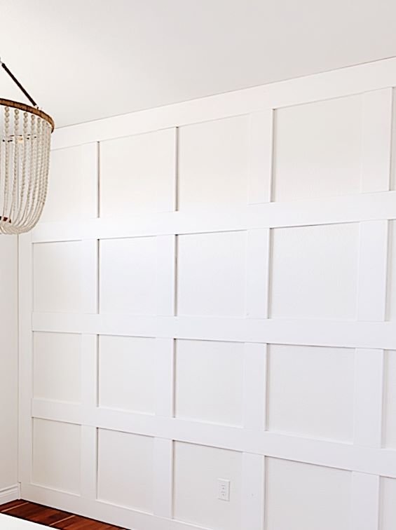
There is nothing more overwhelming than an empty apartment full of plain white walls. Sometimes, you can paint, but that still leaves the walls plain and boring. Add some visual excitement with these tips!

Image Credit: Your Modern Cottage

Create a gallery wall to fill up empty wall space. You can find inexpensive frames from Ikea, fill them with either your own photography or digital prints from online (Etsy has options for just about every style), and secure them with Command® picture hanging strips to prevent damage to the walls. 

Image Credit: Caitlin De Lay

Removable wallpaper is a fun way to add dimension and color to a boring space. You can find some really fun prints on Amazon that are so easy to apply and remove in seconds. 

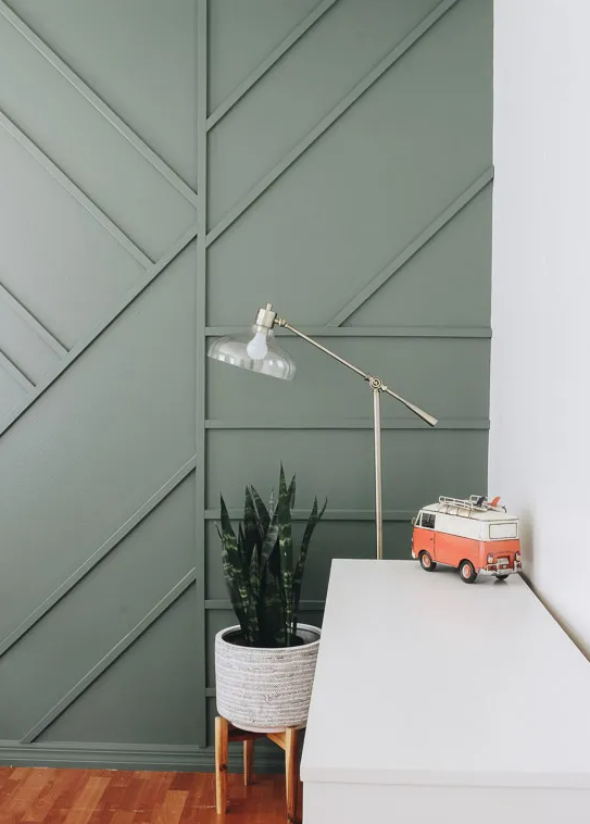
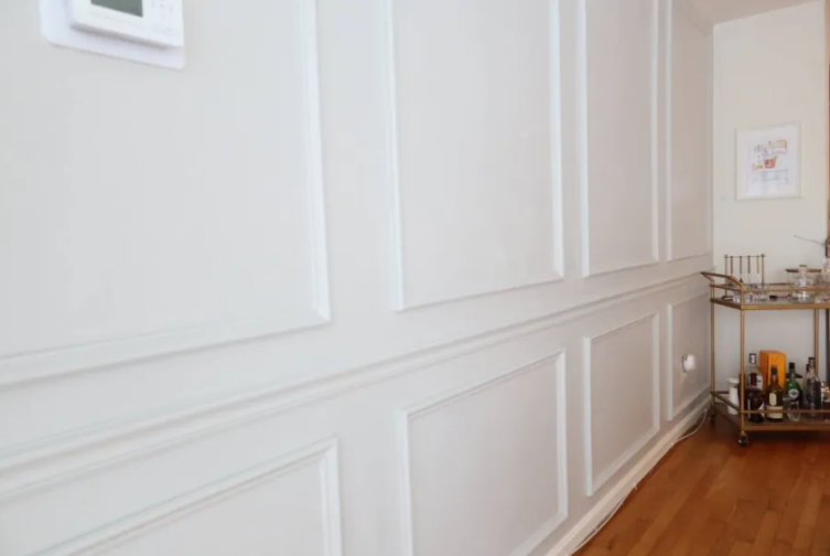
Image Credit: MyDomaine

Add molding to give your space a homey, traditional appearance. Purchase some quarter round from your local hardware store, measure and cut to fit your space, and attach with removable velcro strips or another heavy-duty damage-free adhesive.  There are so many options, from classic picture frame style to bold, modern geometric patterns.

Floors

Unless you move into a brand new build, or you have an awesome landlord that replaces the flooring between each tenant, chances are the floors in your rental have seen better days. 

Eagle Rock Properties

Area rugs are essential for protecting your hard floors (and security deposit!), insulating your living space during the winter, absorbing noise, and they will even soften the impact of your footsteps if you have neighbors below you. Large rugs can get expensive, so check discount stores and websites, like www.homegoods.com and www.overstock.com for deals. Area rugs can make a big impact on a space, by adding a more “finished” look and really tying all the components of your design together.

Image Credit: Style by Emily Henderson

Peel and stick tiles have taken TikTok by storm! User TieraLovellee demonstrates how she transformed her bathroom floor using removable marble tiles and the results are incredible. ​​

Lighting

Lighting can make a big difference in any space, but it is a very important consideration for apartments where limited natural light and outdated fixtures are common. 

Image Credit: Country Living Magazine

Wall sconces add a cozy feel to any space. Either a plug-in variety or a remote-controlled battery option are the best (existing sconce + these remote-controlled LED puck lights + adhesive = a renter friendly inexpensive wall sconce)

Image Credit: YLighting

These rechargeable, remote-controlled under cabinet lights from Amazon are another product featured in many content creators’ Amazon Storefronts. They rave about how easy they are to use, and how the lighting can transform their space. See how @eastcoastdiy on TikTok transformed her kitchen with these simple adhesive lights!

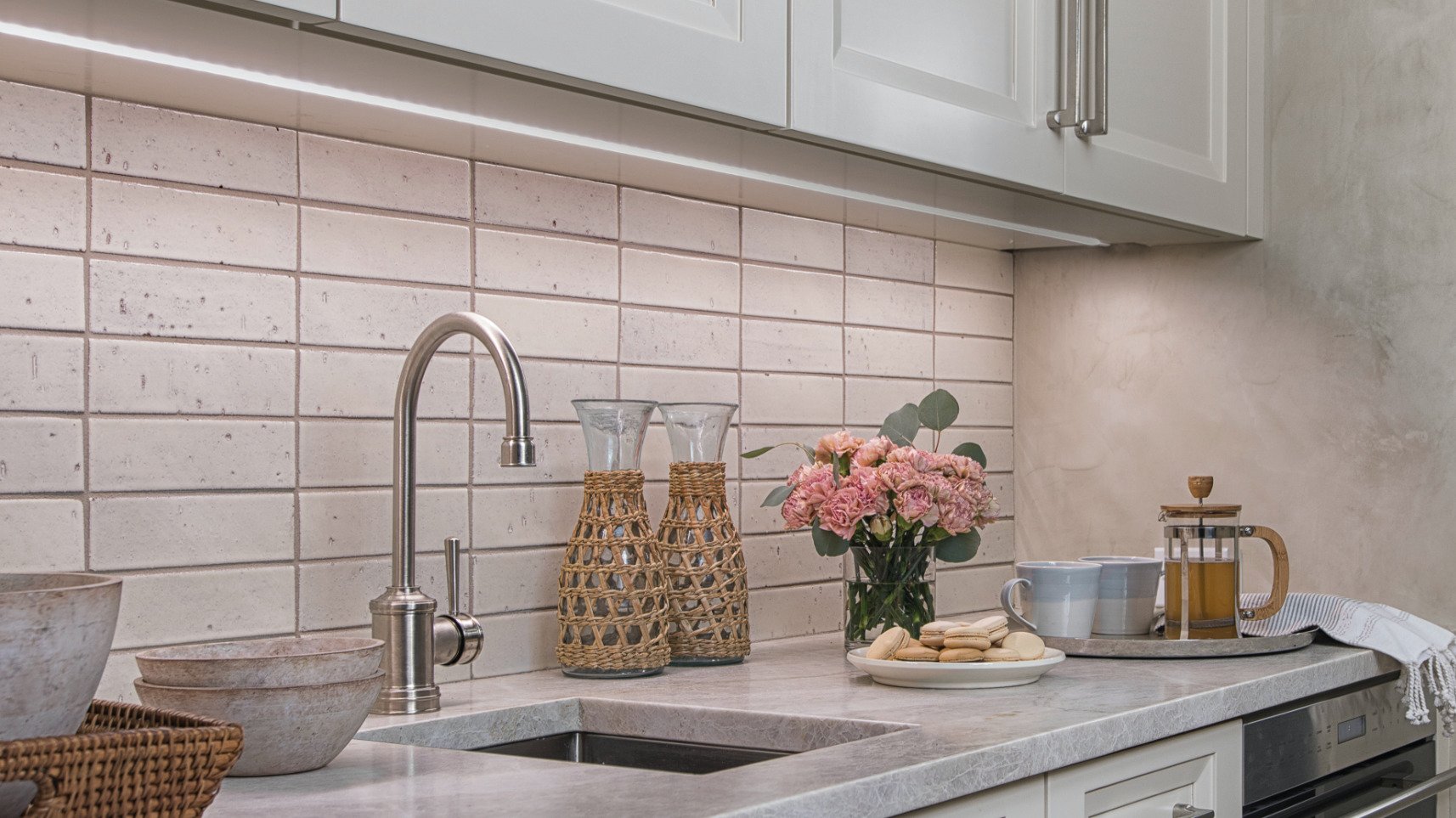
Tresco® Lighting has many standard and customizable options for under cabinet, above cabinet, toe-kick, and many other applications. To make it renter-friendly, use a heavy-duty removable adhesive in place of the included hardware. 

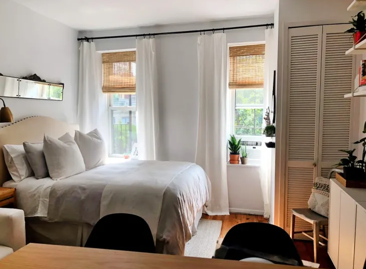
If you have old blinds that have seen better days, consider switching them out for more modern varieties, like roman shades or cellular blinds (you might even save some money on your electric bill with cellular shades!). 

Credit: Apartment Therapy

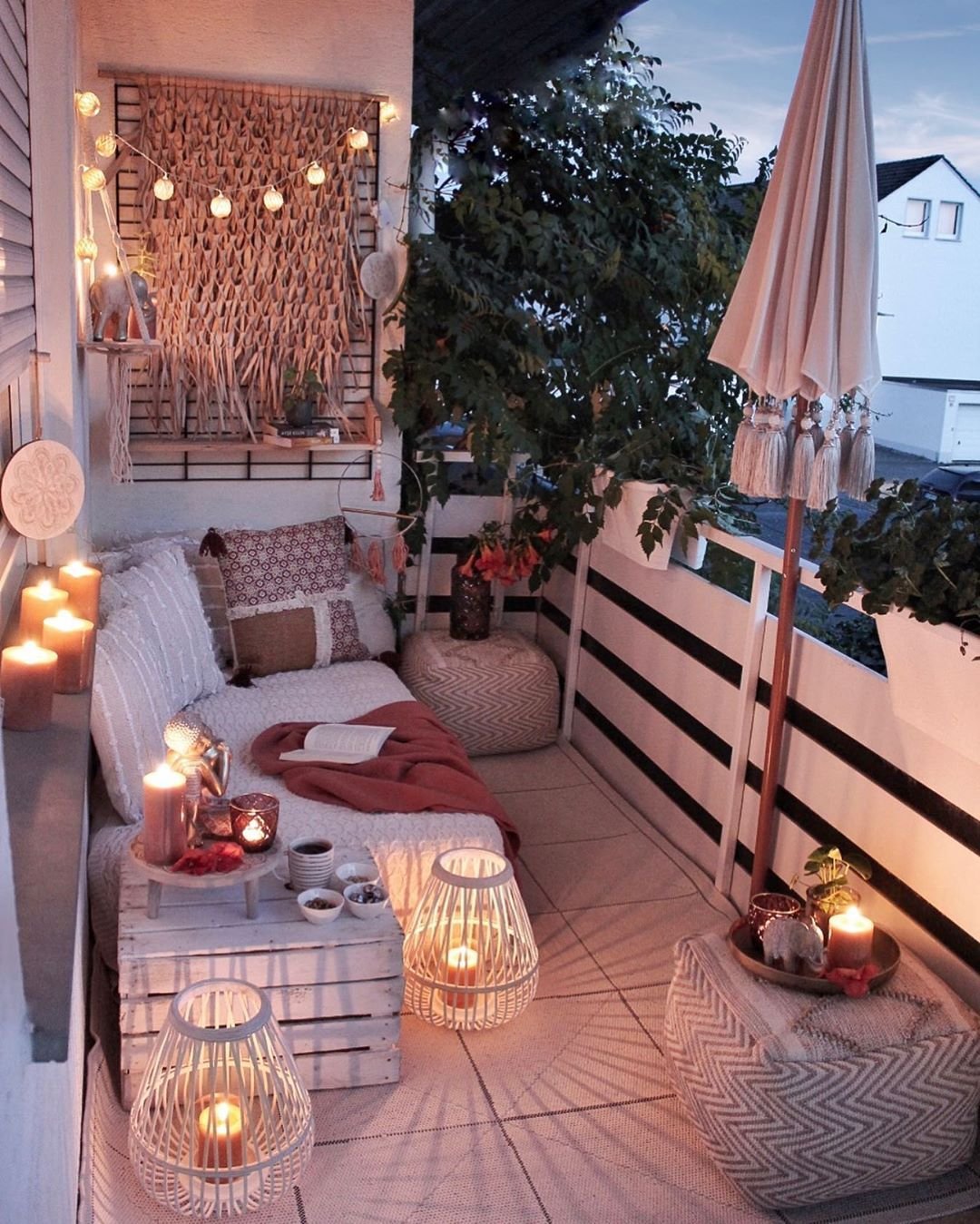
Finally, extend your living space by turning your balcony or patio into a relaxing summer evening hangout spot with some outdoor LED lighting.

Credit: roohome.com

Kitchen

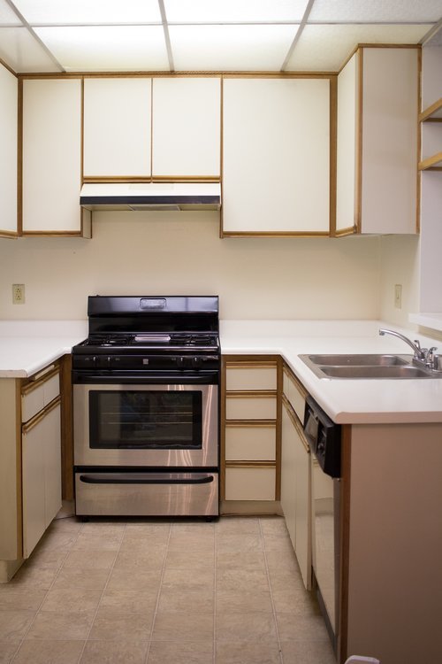
The kitchen is the heart of the home, so it is important to ensure it's a place you love spending time. There are a lot of rental kitchens that have seen better days (like the 1980’s… yikes), so use these tips to bring them into the 21st century for the duration of your lease. 

Image Credit: Black & Blooms

Use contact paper to hide atrocious countertops (tutorial here)! Pick a modern design, apply, and enjoy for the duration of your lease. It is easy to remove and as a bonus, it offers an additional layer of protection for your countertops (hello, security deposit!). 

Image Credit: Cabana State of Mind

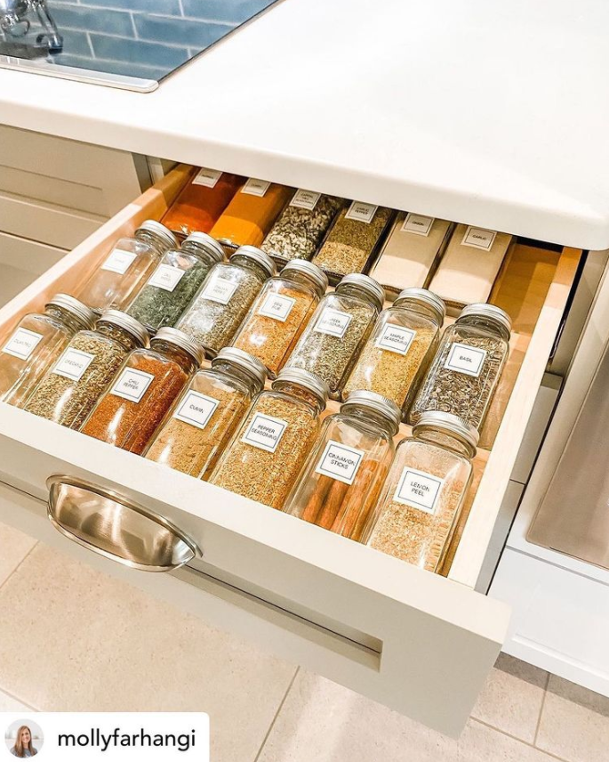
Install drawer inserts to make the most of the limited storage space. Keep your utensils tidy with this one or have an insta-worthy spice drawer with this insert! Both inserts are from Rev-A-Shelf®

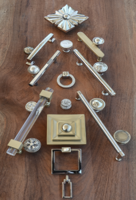
Don’t underestimate the power of cabinet hardware! Just make sure to buy the same size (it needs to fit in the existing holes!) and keep the original hardware tucked away for move-out day. Just look at the difference one quick switch can make!

Image Credit: Forbes

Conclusion 

How can you apply these tips to turn your basic rental into a fun space that reflects your unique style? Think like a professional and follow the basic principles of interior design:  

Image Credit: Philadelphia Style Magazine

  • Balance: distributing the “visual weight” of a space to create a feeling of equilibrium. This is achieved through symmetrical, asymmetrical, and radial balance. 

  • Rhythm: creating visual interest through patterns and repetitions in the design

  • Harmony: the unified feeling created from all elements of a good design acting together

  • Emphasis: directing attention to one focal point, to avoid a scattered or boring feeling

  • Proportion and Scale: “Proportion is the ratio between the size of one part to another, and scale is how the size of one object relates to another or to the space in which it is placed” (Credit: The Spruce)

The biggest takeaway from these guidelines is to ensure you carefully plan each area of your rental space and how you want to decorate it, to avoid an unbalanced or cluttered appearance. 

Image Credit: frankieandjonnie via Reddit


What are your favorite renter-friendly design tips? We would love to know! 

Design Trends for 2022

Over the years, we have witnessed some really great design trends that lasted many years, and some that couldn’t go out of style fast enough. 2022 is quickly approaching, and with that, let's look at some of the anticipated trends for kitchen design.  


Minimalism has been a popular trend for the last few years, and it looks like it's going to be here to stay for a while. In the kitchen, this looks like: 


  • Clean, clutter-free counter spaces. We are going to see more “appliance garages” to hide small appliances like the toaster and air fryer.  

  • Additionally, disguising major appliances as cabinets will continue to gain popularity.  

  • In more modern kitchens, hardware will be phased out. Push-to-open cabinets may start to replace the need for traditional cabinet pulls. 

  • Large, organized pantries are in high demand, for both new builds and home renovations.  

  • In a true pursuit of minimalism, open shelves are starting to replace traditional upper cabinets in the kitchen. They give the kitchen a more light and airy appearance, as opposed to the closed-off feeling cabinets can give in a small space. These shelves can be a way to decorate functionally, displaying dishes, cookware, or ingredients, or recipe books. 


Colors + Finishes for the Kitchen 


Everyone has their own unique taste when it comes to the finishing touches of their kitchens, but here are some of the popular trends for 2022: 

  • White cabinets will continue to be a timeless choice, but natural wood finishes and neutral colors will increase in popularity 

  • Sage green and midnight blue will be in high demand 

  • Matte finishes are preferred for their clean look 

  • Wood floors (especially low maintenance options such as luxury vinyl plank) and large tiles will continue to be consumers’ top picks  

  • Two tone cabinets! Typically white or a light neutral on upper cabinets, and a darker or bolder color on the lower ones 

  • Darker finishes for faucets + cabinet pulls 

  • Contrasting colors throughout the room to avoid the “sterile” appearance of one color 


Trends That Apply to the Whole House:  


  • Open concept floor plans have been around for a while now, but many homes are taking it a step further to create a seamless flow from room to room. Many homeowners are phasing out their L-shaped kitchen in favor of a more linear layout,  further blurring the boundaries of each “room”.  

  • Smart home technology is continuing to integrate into every room of the house, and the kitchen is no exception. Smart refrigerators, Wi-Fi-enabled coffee machines, app-controlled meat thermometers, toothbrushes that let you know how well you brush, the list goes on and on!   

  • Sustainable sourcing/eco-friendly products and materials will be more important than ever for many consumers.  

  • Biophilic design- According to Metropolis Magazine, “Biophilic design seeks to connect our inherent need to affiliate with nature in the modern built environment. An extension of the theory of biophilia, biophilic design recognizes that our species has evolved for more than 99% of its history in adaptive response to the natural world and not to human created or artificial forces. We became biologically encoded to associate with natural features and processes. Rather than being vestigial – or relevant to a world that no longer exists – this need is thought to remain instrumental to people’s physical and mental health, fitness, and wellbeing”. This can easily be achieved through houseplants, natural lighting, and good ventilation indoors.  


Brass is Back and Better Than Ever

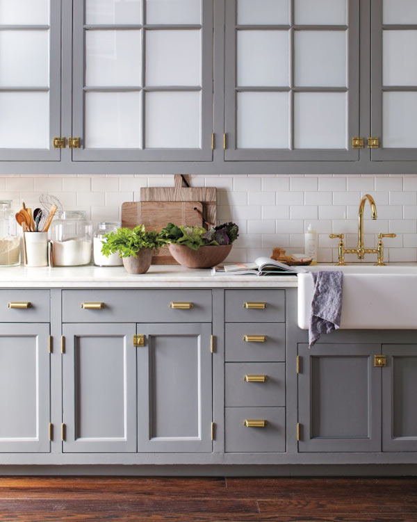
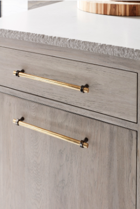
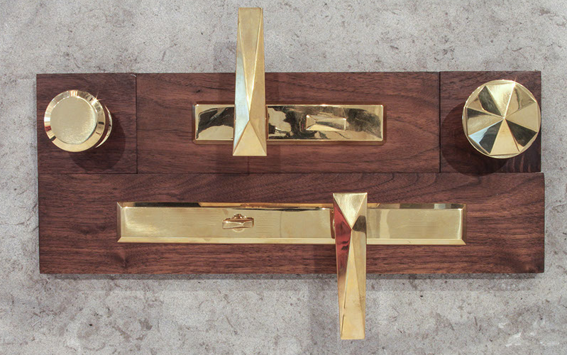
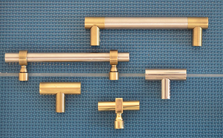
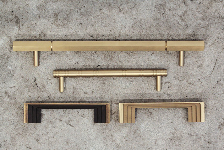
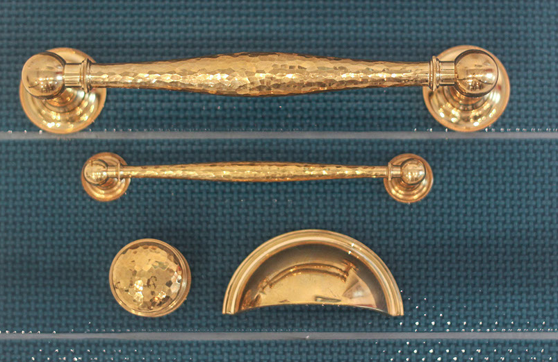
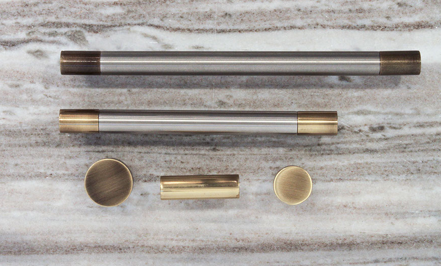
Gold is good, but brass is better.

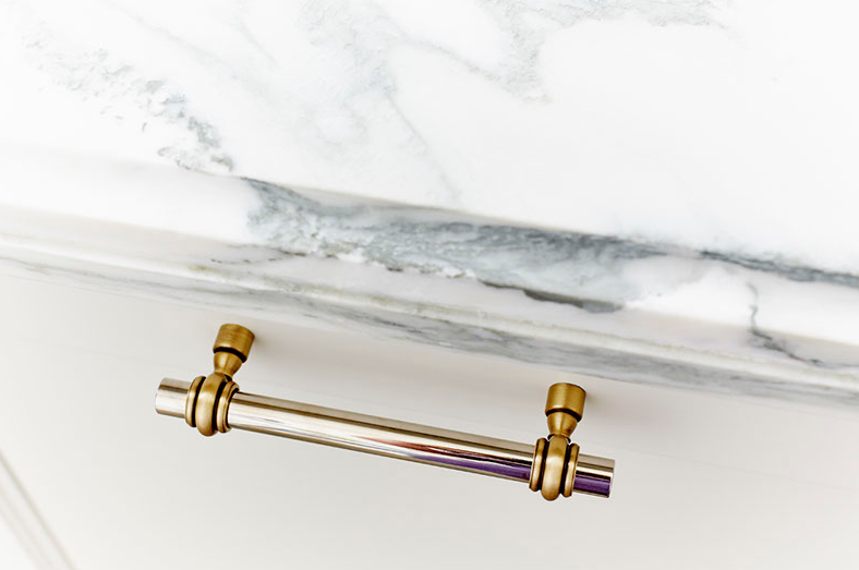
This luxurious-looking hardware is back on the design scene in a big way. It's bold, bright, beautiful...all the alliterations! Far gone are the days of the shiny and yellow, and here to stay are beautiful pieces fit to brighten any design style.

Kitchen Design by Matthew Quinn of Design Galleria

Kitchen Design by Matthew Quinn of Design Galleria

1464013011348.jpg

MODERN

TRADITIONAL 

Kitchen by Martha Stewart // Hardware by Martha Stewart Living // Photo by Eric Piasecki

Brass Elements - The AG Market Waco.jpg

BOHO // ECLECTIC


Steel Shelving Brackets by The Ag Market Waco

Modern Farmhouse.jpg

MODERN FARMHOUSE 

Kitchen by Cutting Edge Homes // Hardware by Edgecliff

Check out these beautiful designs by the

Matthew Quinn Collection